A great collection of examples to open your eyes up to what can be done in Powerpoint
A really good set of examples and how to's on some interesting presentation effects using Powerpoint
This sort of animated text or "Kinetic Typography" could form part of how some information was presented.
This video shows how simple animation through Powerpoint can make the presentation of an organisational type chart have more impact and visual interest.
The links above are videos around animation on power point that could help me develop appealing animations for the final documentary.
The link at the very top(Presentation Load PowerPoint Templates) was very interesting because it puts complex and appealing text manipulation into simple steps which proved there was more to powerpoint than i imagined, anyway because of this link I came up with some ideas I could use in the future such as the "zoom effect" which I can use to highlight important statistics
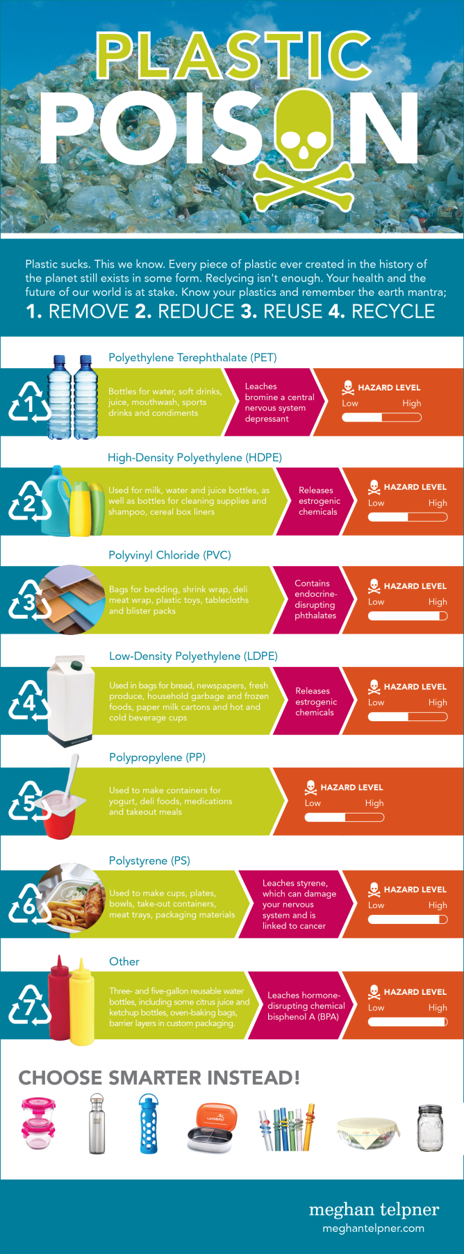
In the info graphic shown above, the is information around my group's topic of plastic packaging. For example, I learned that most food packaging was made out of polypropylene as well as the fact that it is somewhat toxic to marine life, though this isn't a good example of what I'm supposed to achieve for the final outcome, I could put information like this together in video format so it fits in well with the documentary.
Example of good infographics
The link above is a video about the waste that could be found in a takeaway box. This is a prime example of what the final documentary might look like and what my statistics should look like as well, eye catching and detailed. Also, the statistics were colorful which made the video much more interesting so minor aspects that come in while making these info graphic videos such as the text font makes a big difference to the audience. I think what made the video even better was the fact that the statistics were quick and fast, I only had to read some numbers over the narration which is better as if I just read the text, it would have been pretty boring so from now one of my main goals is to make a video that can please the audience.
No comments:
Post a Comment